Detroit Opera
When the Michigan Opera Theatre came to us they were at an exciting moment in their history. MacArthur Fellow Yuval Sharon had become their new Artistic Director, bringing innovation and a new perspective into one of Detroit’s most historic cultural institutions. We were brought on as a strategy and design partner, not only to rebrand an icon, but to rename it as well. The next chapter in the Opera needed a completely fresh identity that connected to its current base and also attracted fresh audiences so vital to the Opera’s future.
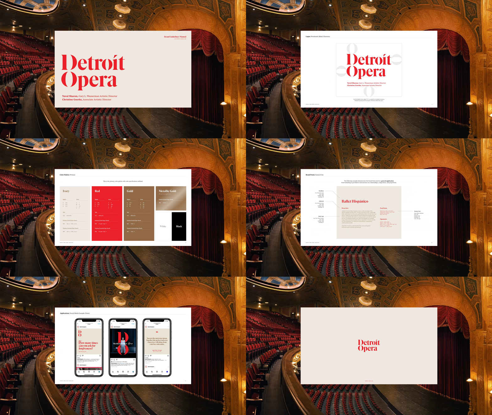
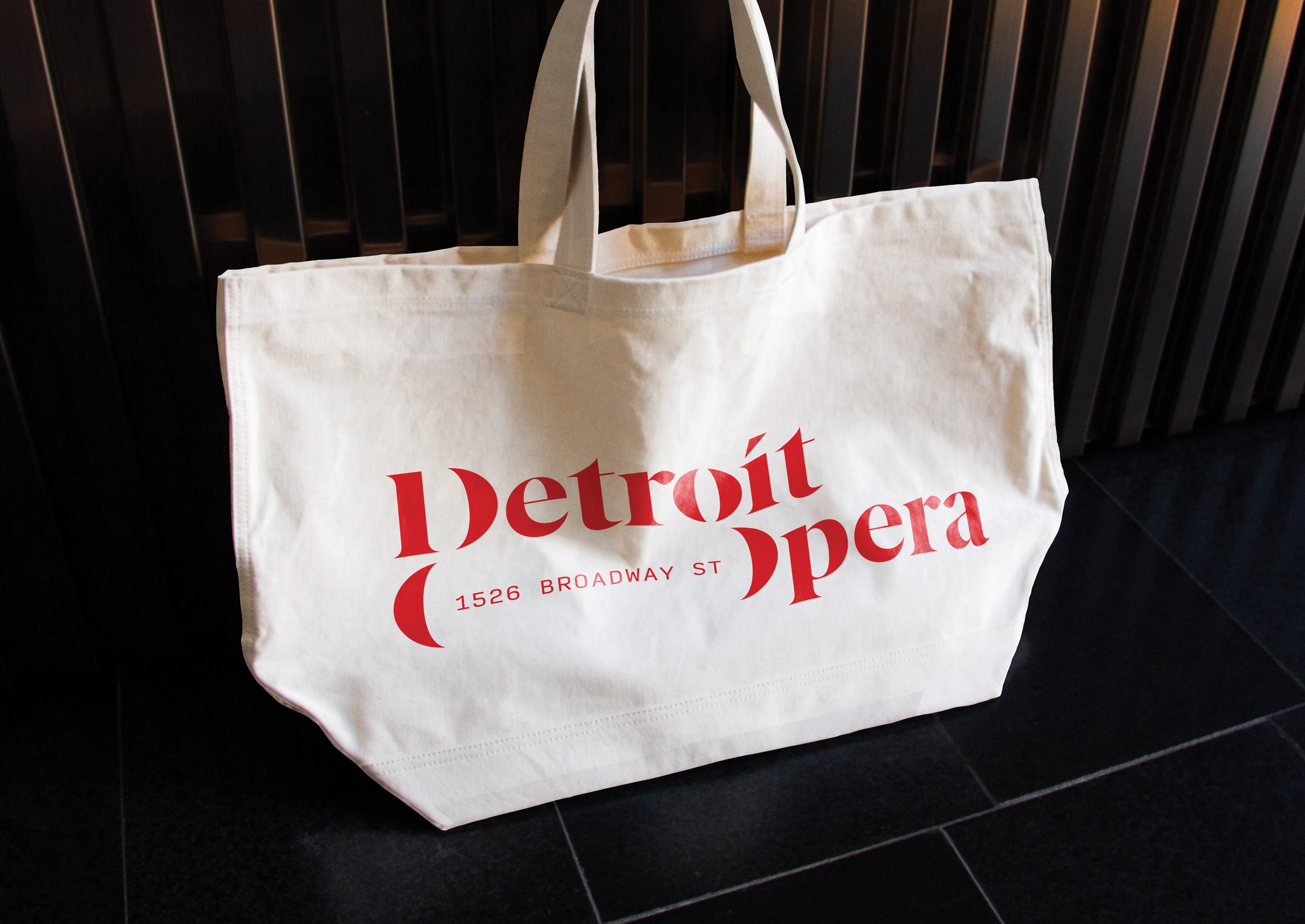
The visual identity consists of a kinetic typographic system that allows the brand to be flexible across various design applications. The primary typeface of the logo is inspired by the grassroots culture and visual artwork found throughout Detroit — primarily graffiti, street art, and stenciling. We paired that with a modern monospaced typeface to elevate the tone. We then included a tertiary blackletter typeface for small accents that adds additional personality and movement to the brand identity. The blackletter typeface was chosen both out of respect for opera’s centuries-old traditions as well as a subtle nod to the iconic Old English Detroit “D,” most familiar to people as the logo of the Detroit Tigers. We created a full graphic brand system consisting of logo, color, typography, stationery, and social media art direction. Additionally, we also created unique show art for the season, marrying the brand identity to unique visuals capturing each show’s essence.
Design Awards: Communication Arts Design Annual 2022, Graphis Design Annual 2023
Project Partners: Paolo Catalla - Brand Design, Photography courtesy of Detroit Opera


