GoldBug
Parenting is an unpredictable journey, filled with both challenges and moments of pure joy. GoldBug, founded in 1968, is a woman-owned distributor of infant and children’s accessories. Goldbug came to us with a desire to consolidate its various brands (GO by Goldbug™, TravelBug™, On the Goldbug®, and Goldbug™) into a cohesive, direct-to-consumer identity. Our collaboration with GoldBug aimed to strategically reposition the brand as a trusted companion on the parenting journey, offering innovative products that simplify and embrace life's big and little moments.
Working closely with the GoldBug team, we dove into the essence of parenthood, acknowledging the beauty found in the unscripted moments of everyday life. We identified the strategic creative territory of “Everyday Adventure,” reframing the chaos of parenting as a collection of authentic memories that contribute to the magical journey of growth. This also strategically shifted the brand positioning from “travel” (a category still in decline from the pandemic) to everyday and on-the-go. This concept served as the foundation for our brand strategy, informing every aspect of the design process.
From there, we established the tagline “We don't just go, we grow.” This message encapsulates the brand's mission to support children and parents on their journey of growth and discovery. From print and packaging to digital applications, every touchpoint reflects the brand's new identity, creating a cohesive and compelling brand experience for consumers.
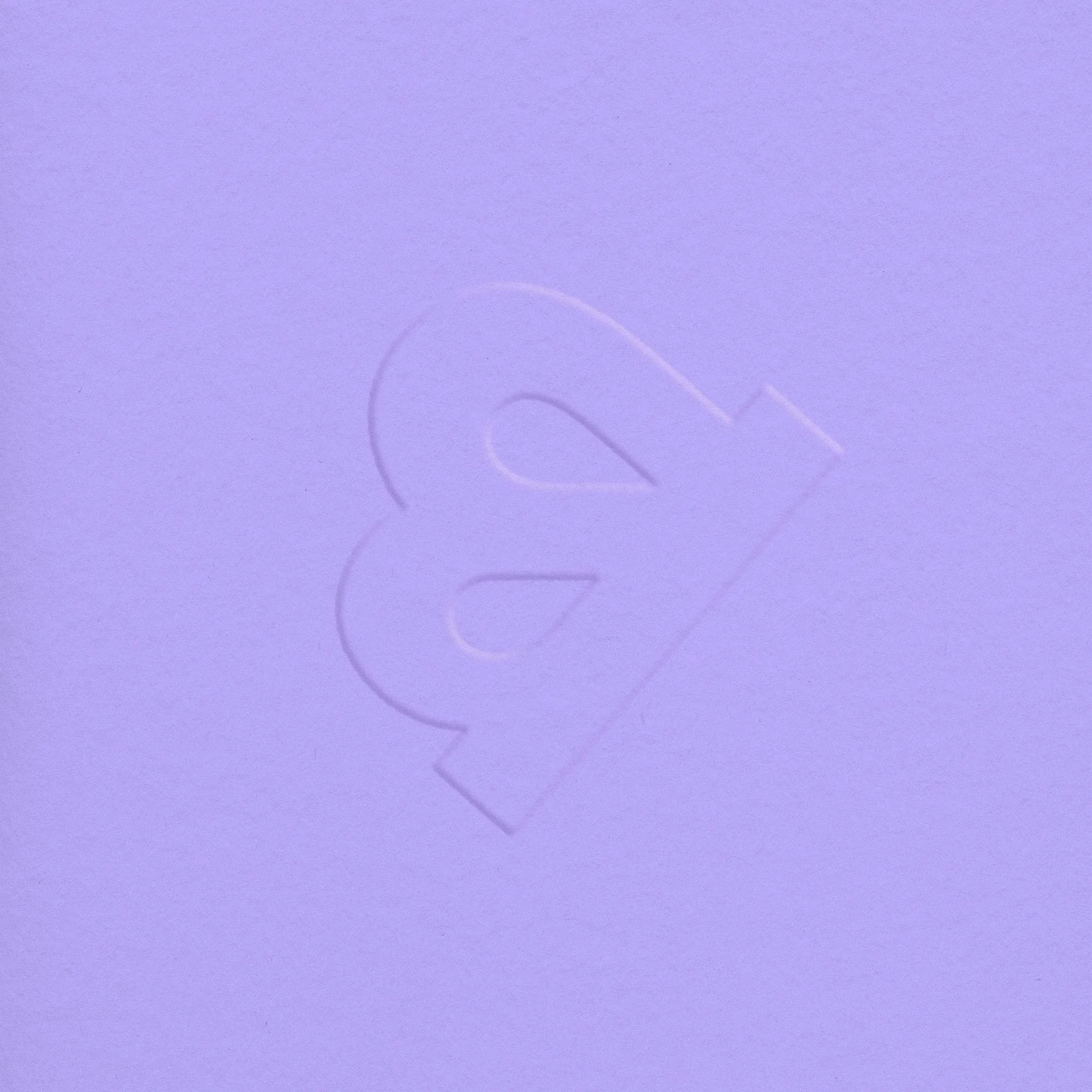
Drawing inspiration from the notion of growth and adventure, we crafted a brand identity that resonates with modern parents. The logo, typography, and color palette were carefully curated to reflect the brand's commitment to quality and reliability, while exuding a sense of optimism and playfulness. The new logo was designed to pay homage to the previous Goldbug logo which featured a butterfly, as a way to carry the brand’s legacy into this new chapter. Illustrations featuring subtle imperfections and photography highlighting candid, authentic moments, further reinforce the brand's message, capturing the spontaneity and joy of parenthood.
The GoldBug rebrand exemplifies the transformative power of strategic branding in creating meaningful connections with consumers. By embracing the ethos of “Everyday Adventure,” GoldBug has reaffirmed its position as a trusted partner for parents, offering innovative products that enrich and simplify their lives. As GoldBug officially unveils its rebrand, we look forward to seeing the brand continue to thrive and grow, empowering parents to embrace the unpredictable journey of parenthood with confidence and joy.
Awards:
MUSE Design Awards 2024 - Gold
Graphis Design Annual 2025
2024 Indy Agency News - Top 40 Award