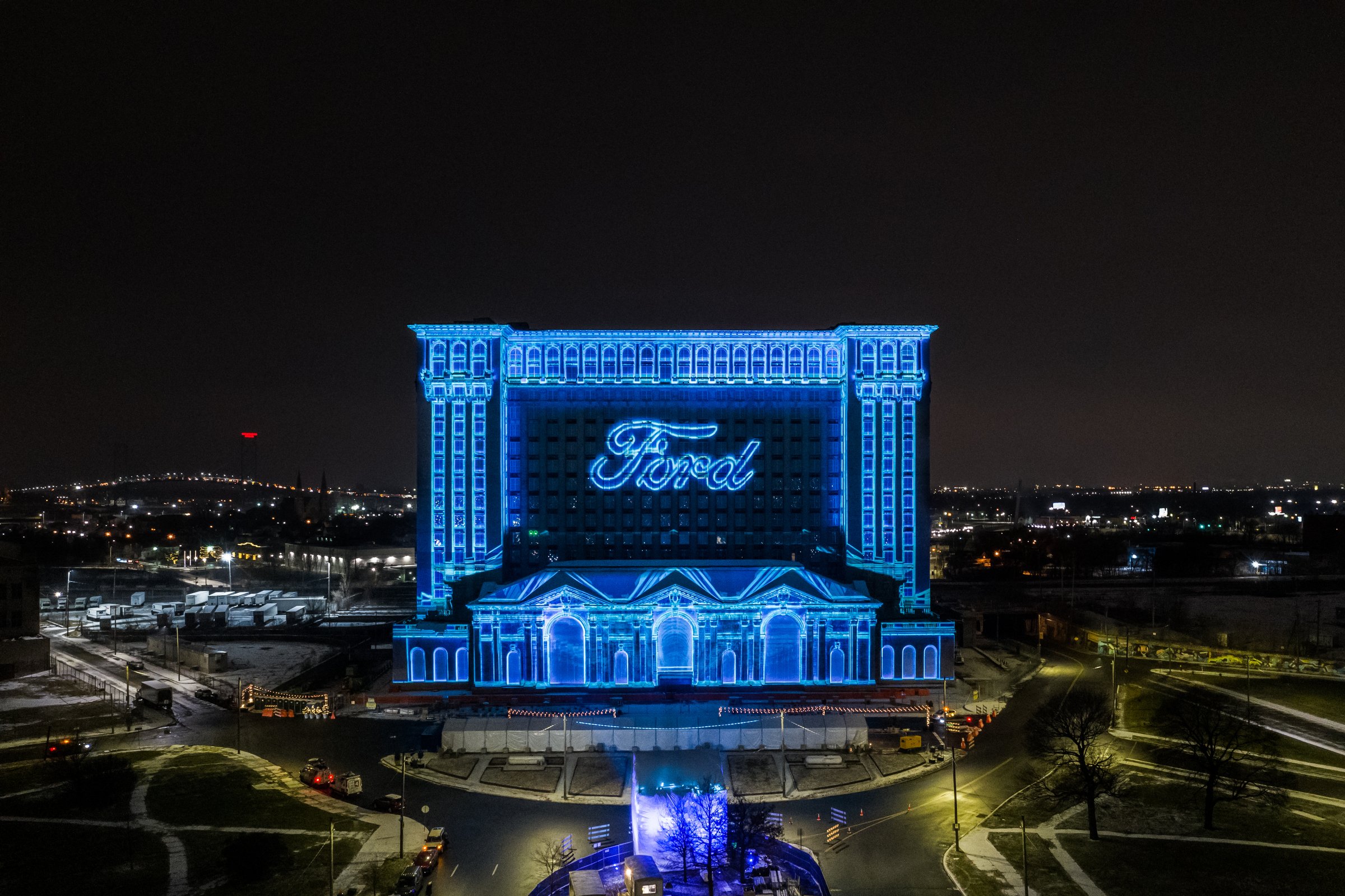
Michigan Central
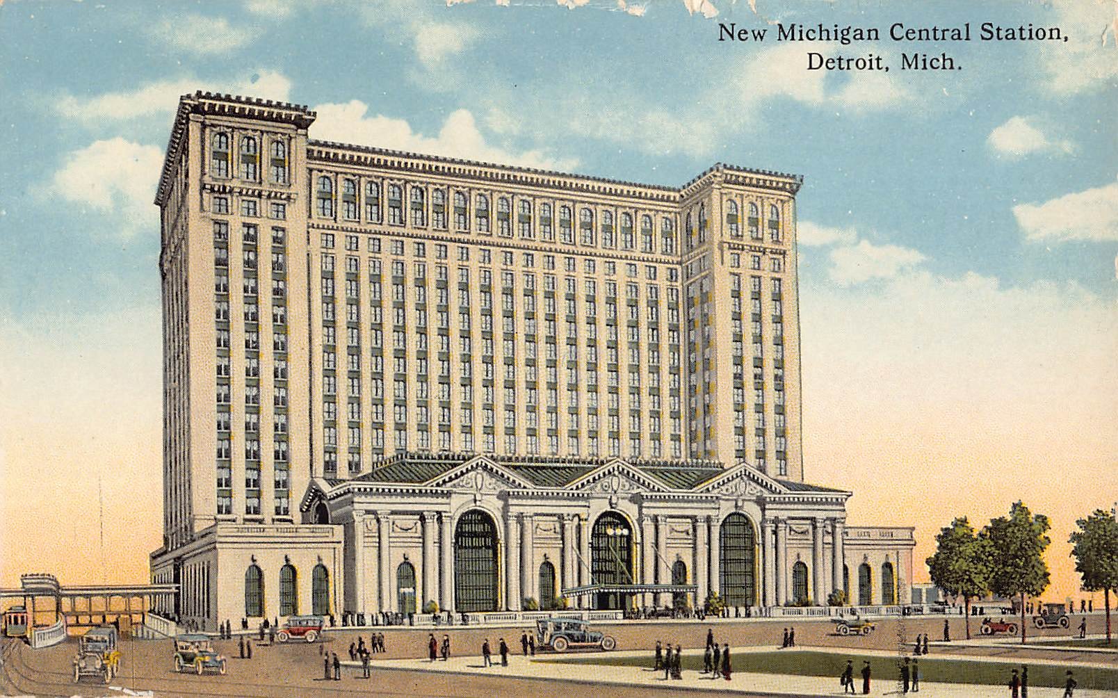
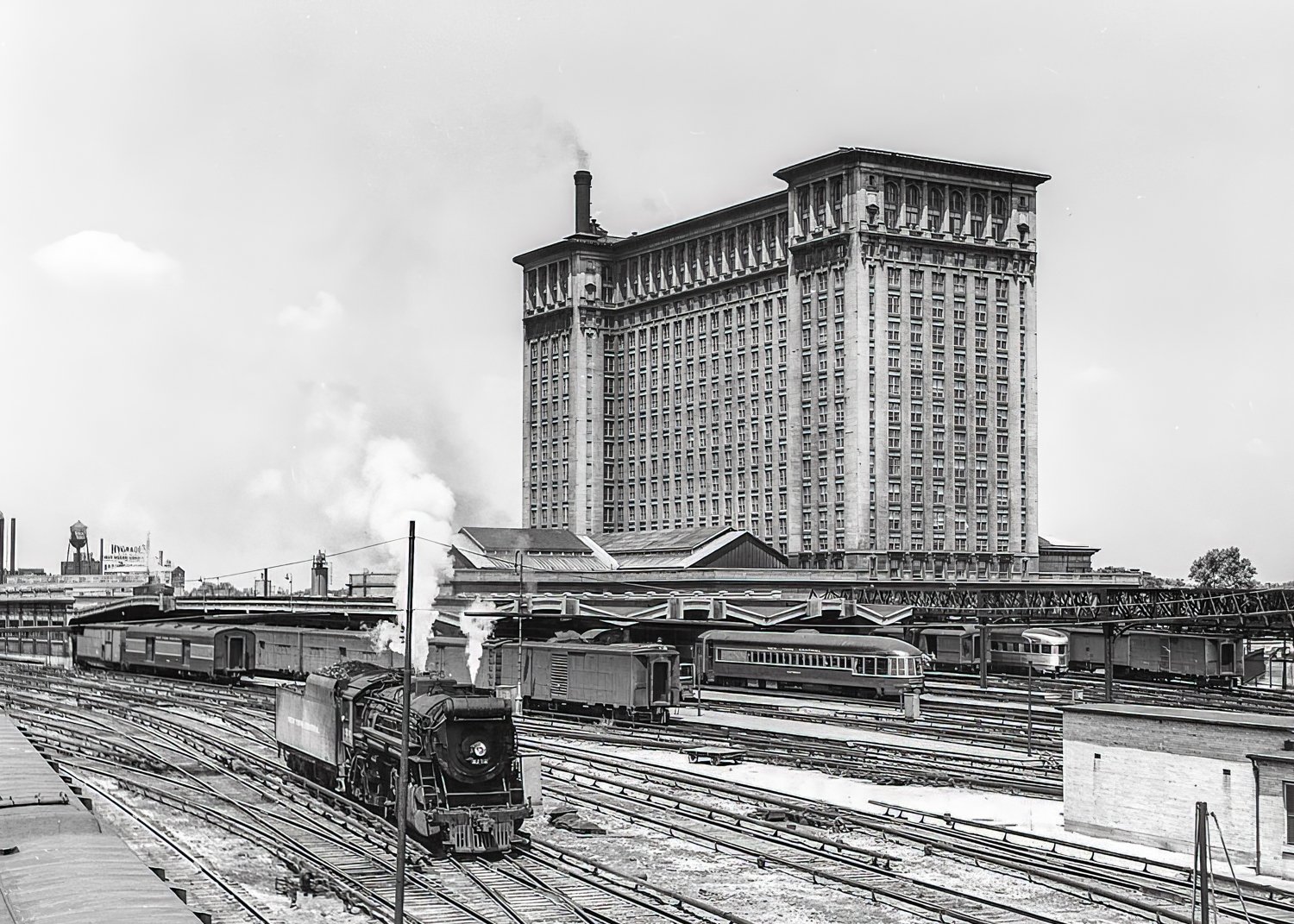
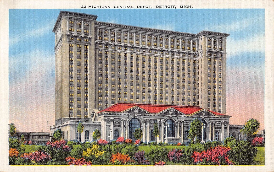
One of the things we pride ourselves on is collaboration. When Ford’s landmark Michigan Central Station project needed a new look and feel, we collaborated with partners to bring the vision to life. We worked with Wiley, to establish the mark and then our team created a comprehensive brand identity that deftly nodded to the station’s storied past while also pointing to the role it will play in defining the world’s mobility future. Simple. Elegant. Smart.
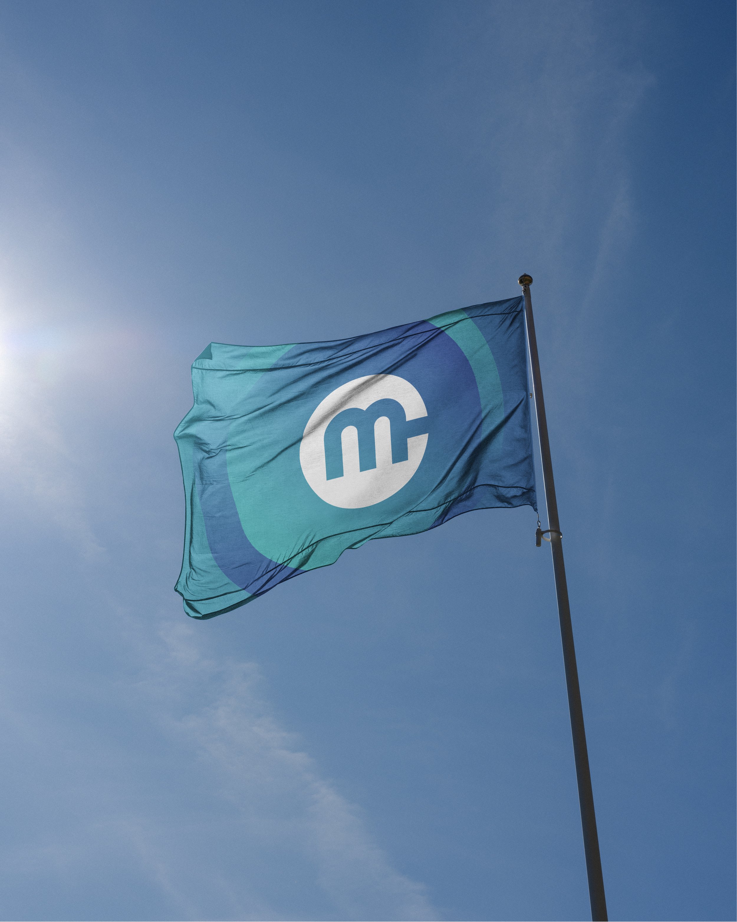
This logo itself elegantly marries an M + C. The intentional form of the M alludes to the iconic arches of the historic train station windows, while the overall form contains hints of classic public transportation icons.
The shades of blue within the color palette tie back to the iconic Ford blue, while these particular tones are bright, vibrant and contemporary evoking a hopeful optimism.
The use of the gradient points to how the station is both a part of Ford and yet evolves beyond “the blue oval”. It indicates the collaborative, inclusive, community-based foundation upon which this project is built.
Once the branding system was established, we worked with Echo Charlie, a digital design and development agency, to bring the digital experience to life online.
Developing the branding for Michigan Central provided an identity based in a rich history while looking forward to its new legacy. The branding has ultimately provided more clarity to the public and key stakeholders, letting Michigan Central stand out as a separate entity of Ford Motor Company, one with its own goals and objectives.
Design Award - Graphis Design Annual 2022
Project Partners - Ford, Wiley Agency, Echo Charlie, Photography courtesy of Michigan Central and Ford

