Toledo Museum of Art
At over 123 years old, Toledo Museum of Art (TMA) is a beloved cultural institution – but the Museum's visual identity hadn’t been touched for decades. TMA sought to ambitiously transform while honoring its legacy.
Awards:
Cannes 2024: Rebrand/Refresh of Existing Brand — Bronze Lion
D&AD 2024: Rebrand — Yellow Pencil
Ad Age Breakthrough Brands — Best Design/Branding of the Year
AIGA 365 Year In Design — Winner
2024 AdAge A-List Creativity Awards: Best Rebrand — Finalist
The One Show 2024
MUSE Design Awards 2024 — Gold
Communication Arts 2024 Design Annual — Award of Excellence
National ADDY's — Silver (Integrated Brand Identity Campaign)
Toledo ADDY's — Bronze (Logo Design)
Toledo ADDY's — Gold (Integrated Brand Identity Campaign)
Toledo ADDY's — Judges Choice (Integrated Brand Identity Campaign)
2024 Gold Clio
-
The Toledo Museum of Art (TMA) came to us with a clear request: A desire to transform while honoring its legacy.
We answered with a total rebrand, including strategy and a holistic design system, that will help TMA continue its journey toward the kind of modern museum they strive to be – one that has its doors open to all. We grounded the rebrand on a strategic platform: The transformative power of art is for all of Toledo.
Art is never static. It’s always dynamic. Our perspective shifts as we cross the room or reassess our views over time. The new TMA logo is a dynamic, multifaceted icon. A symbol of the continual reframing of the history of art. A symbol that evokes the dynamism of art’s emerging future.
There are strategic, beautiful design moments infused in the design system that speak to the Toledo Museum of Art’s DNA. A few examples include:
“T” Icon: The letter “T” icon becoming a symbol for reflecting and celebrating diverse views. It reflects the museum, yes, but also – like Toledo itself – keeps evolving, incorporating new voices and fresh perspectives. The ”T” symbol is drawn from the campus footprint, putting the museum in constant conversation with the ever-evolving future of art.Typography: The typography selections draw significant inspiration from historical typographic styles employed by the museum over the years. The combination of a refined sans serif typeface with a supporting serif typeface has been carried forward and has been evolved to give flexibility to the new identity.
Color: The identity is expressed through an adaptive color palette – thoughtfully reflecting the artwork within view. Two color fields are selected and sampled from, each expanding into three color saturation options.
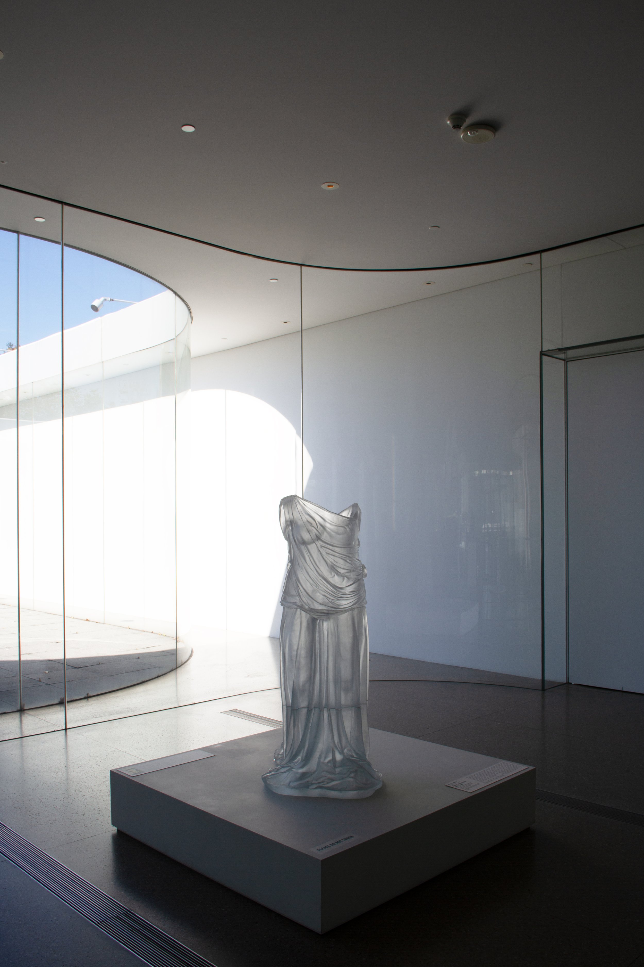
Glass: And finally, paying homage to Toledo’s history as The City of Glass, the alchemy and symbolism of glass is infused within the identity and applications wide-ranging from online to on campus.
This is a brand identity that expresses the bold confidence of TMA — moving out into the community, revealing new perspectives, and shaping the future of where museums go next.
The advertising and social media campaigns that have leveraged the new brand identity have helped us increased year-over-year museum visitation by 20% and year-over-year exhibitions ticket sales have grown 140%.
-
Design - Paolo Catalla (Semi:Formal)
Website Development - Madhouse
The TMA Team - Adam Levine, Gary Gonya, Mark Yappueying, Aly Krajewski, Crystal Phelps


